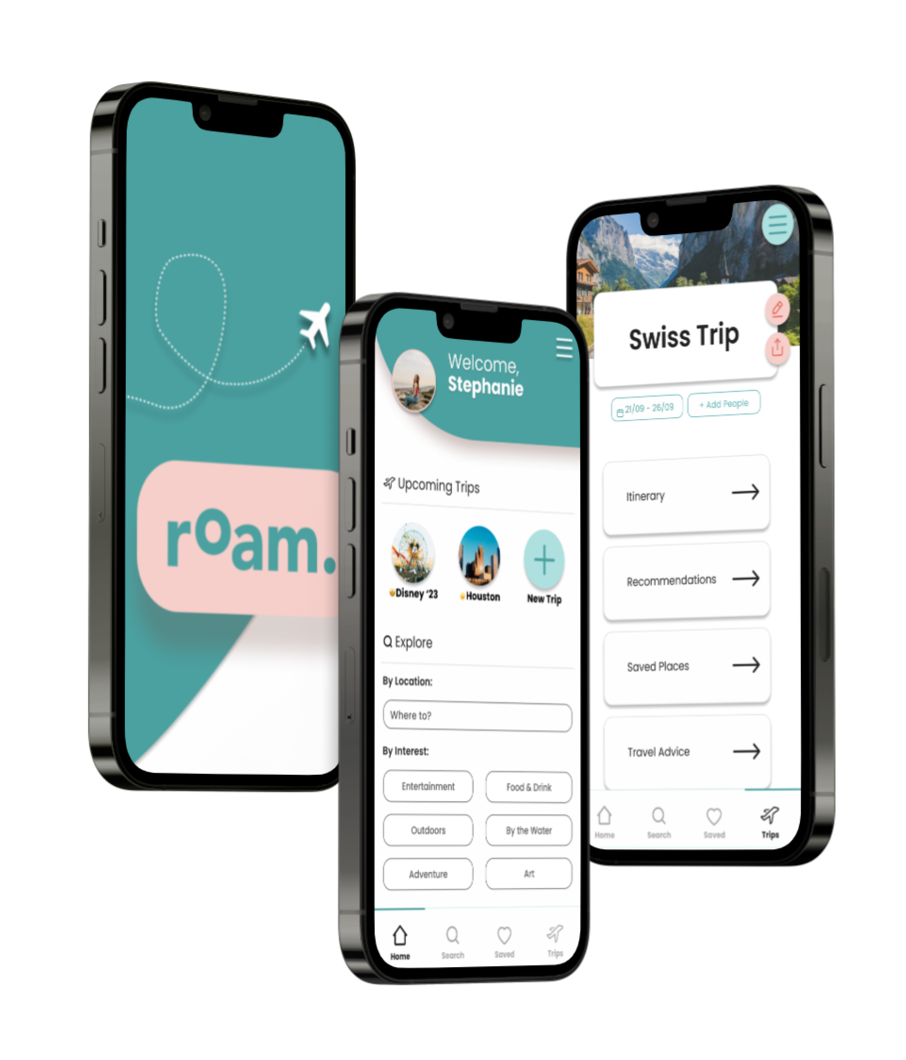

Easing the stress of travel by allowing travelers to create personalized itineraries.
Timeline: 10 weeks
Role: Product Designer
Platform: iOS Mobile
Problem
Travel is important for many reasons - exploring the world, learning about different cultures, and taking a relaxing vacation from work. However, planning a trip can be an overwhelming and stress-inducing process.
Solution
A travel app that allows users to create detailed travel itineraries for upcoming trips.
Research
To strengthen my understanding of the problem space and gain a clearer direction, phase one began with thorough research through published studies and articles as well as peer-reviewed pieces.
A study done in the United States with 110 travelers showed that the most difficult part of their vacation was planning and making travel arrangements (Crotts & Zehrer, 2012)
Another study discovered 74% of participants found the most stressful part to be figuring out tedious details , such as transportation, deciding what to do on a trip, and being unfamiliar with the location (Achor, 2021).
User Interviews
I conducted interviews with 5 individuals who travel at least once per year and were between the ages of 25-50 years of age. The goal of these interviews was to identify what frustrations or challenges travelers face when traveling, how they plan and prepare for upcoming trips, and discover what travelers look forward to the most and least when traveling.

After analyzing these interviews through the affinity mapping process, I chose the strongest theme across all interviewees.
KEY THEME: ORGANIZATION
Travelers feel more assured and relaxed when they have a clear plan and
itinerary.
Design Challenge
How might we assist travelers in planning and organizing trip in order to decrease stress and make the travel experience more enjoyable?
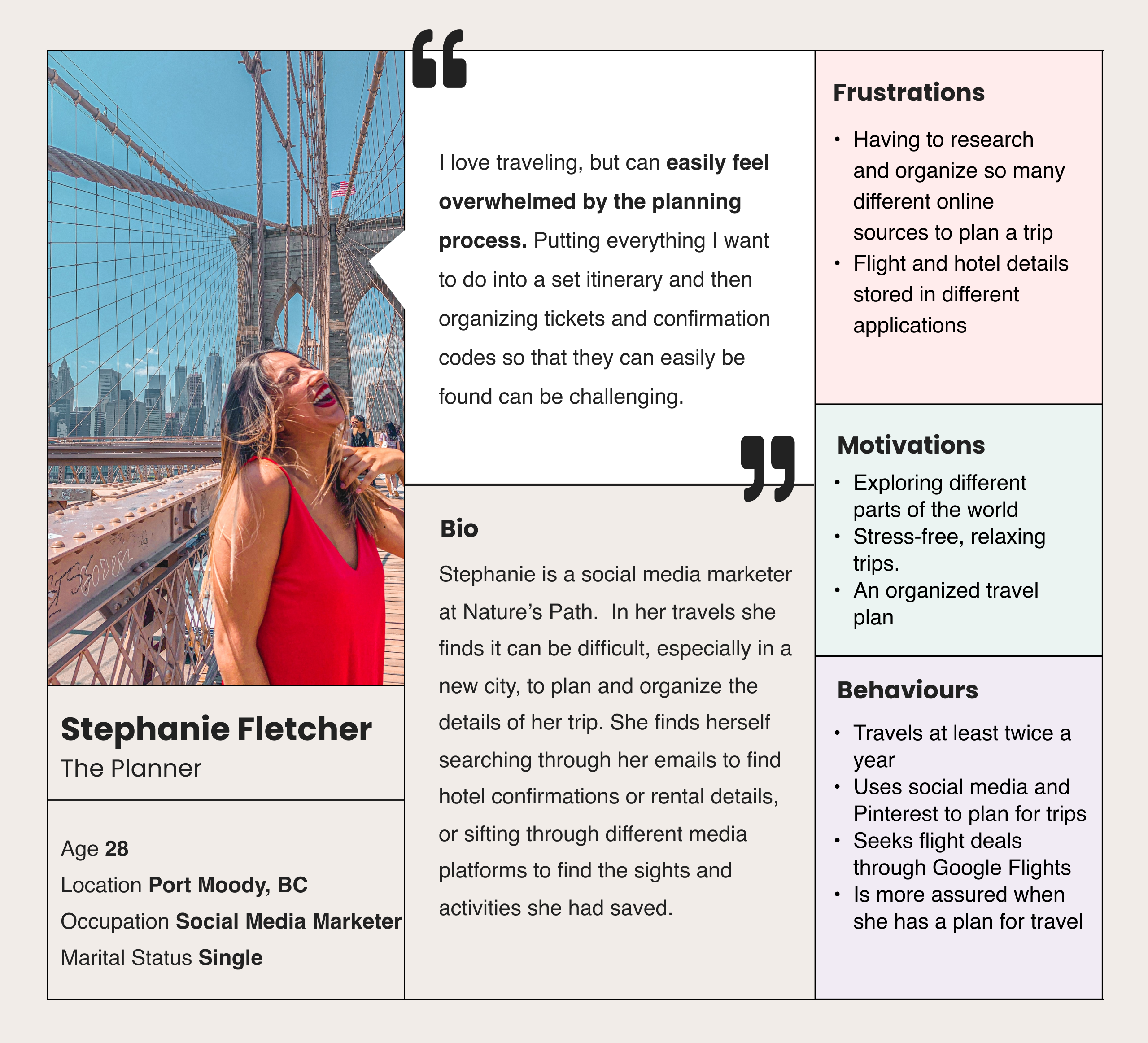
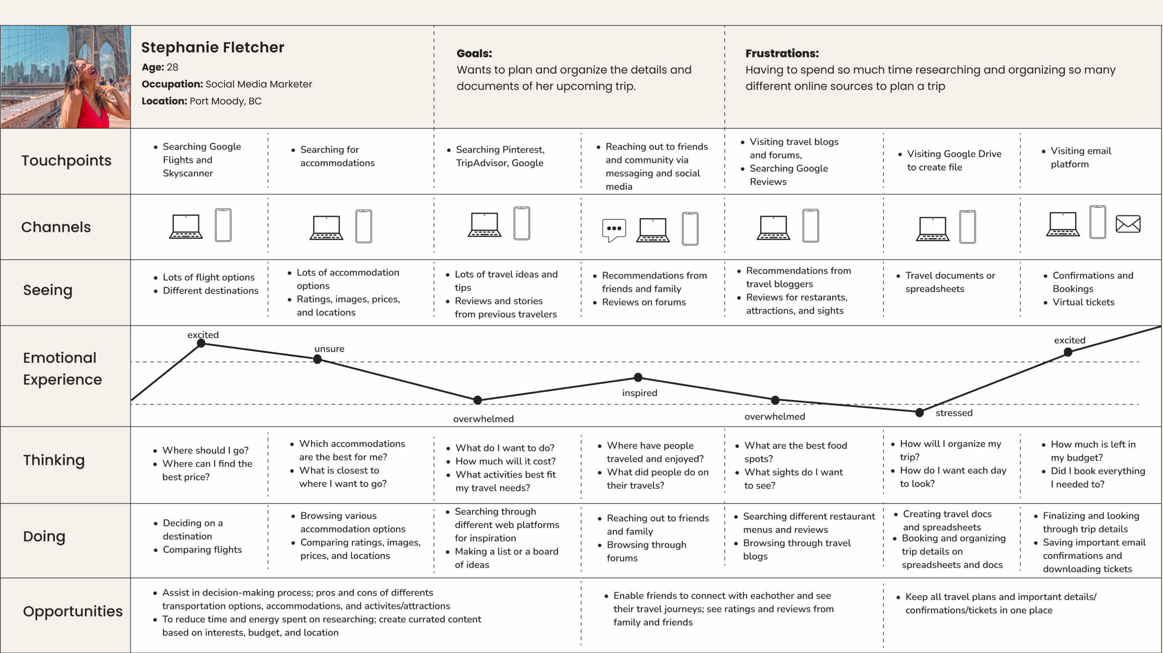
To help understand my users, I developed a persona from interview insights and gathered research. I also created an Experience Map to show the current journey and discover opportunities for improvement.
Define
After authoring over 25 user stories and organizing them into 3 different Epics, I chose to “Organization” to be my core epic. This was chosen because it aligned most with my persona and was a strong painpoint from my primary research.
Core Epic: Organization
As a traveler I want to plan and create my itinerary in advance so that I can be less stressed when traveling.
As a traveler I want to add the dates to my itinerary so that I can know exactly when I am traveling.
As a traveler I want to view each day’s activities so that I can know what I am doing each day.
As a traveler I want to add personal notes to my travel plan so that I can leave notes for myself later.
As a traveler I want to search and add activities and experiences directly to my itinerary so that I know I have enough time for everything.
As a traveler I want to store all my accomodation codes and info in one place so that I can easily access it at all times.
As a traveler I want to store all of my flight tickets and information in one place so that I can easily access it at all times.
As a traveler I want to organize all my important travel documents in one place so that they are easily accessible at all times.
As a traveler I want to add or remove plans from my travel itinerary so that I can customize it as much as possible.
Task Flow
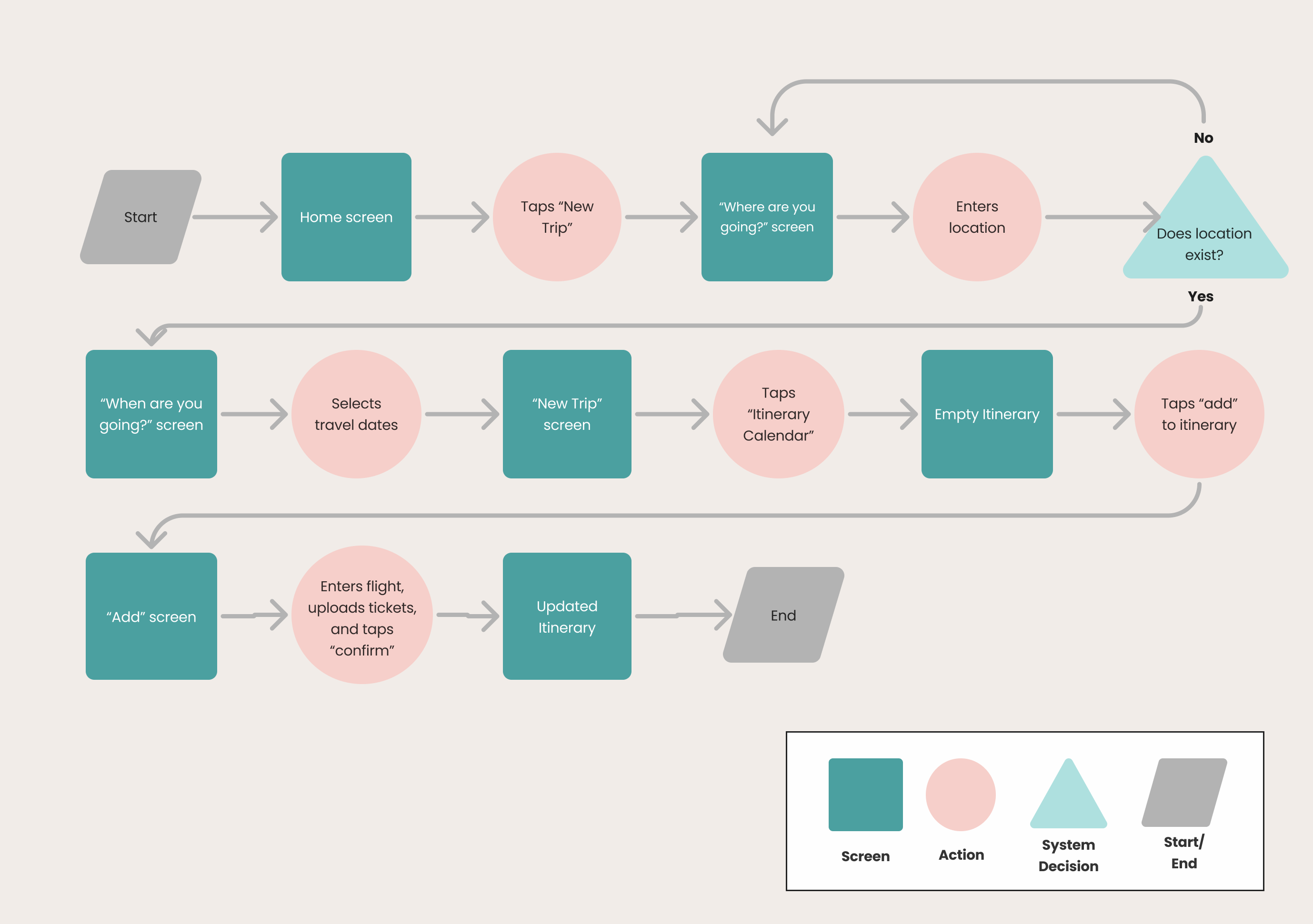
Task: Stephanie wants to create and start adding to her itinerary for an upcoming trip.
Ideation
Building off of my user stories and task flow, along with gathered UI inspiration, I started sketching various concepts ideas which amalgamated into my solution sketches.

Solution sketches translated into mid-fidelity wireframes.

Testing
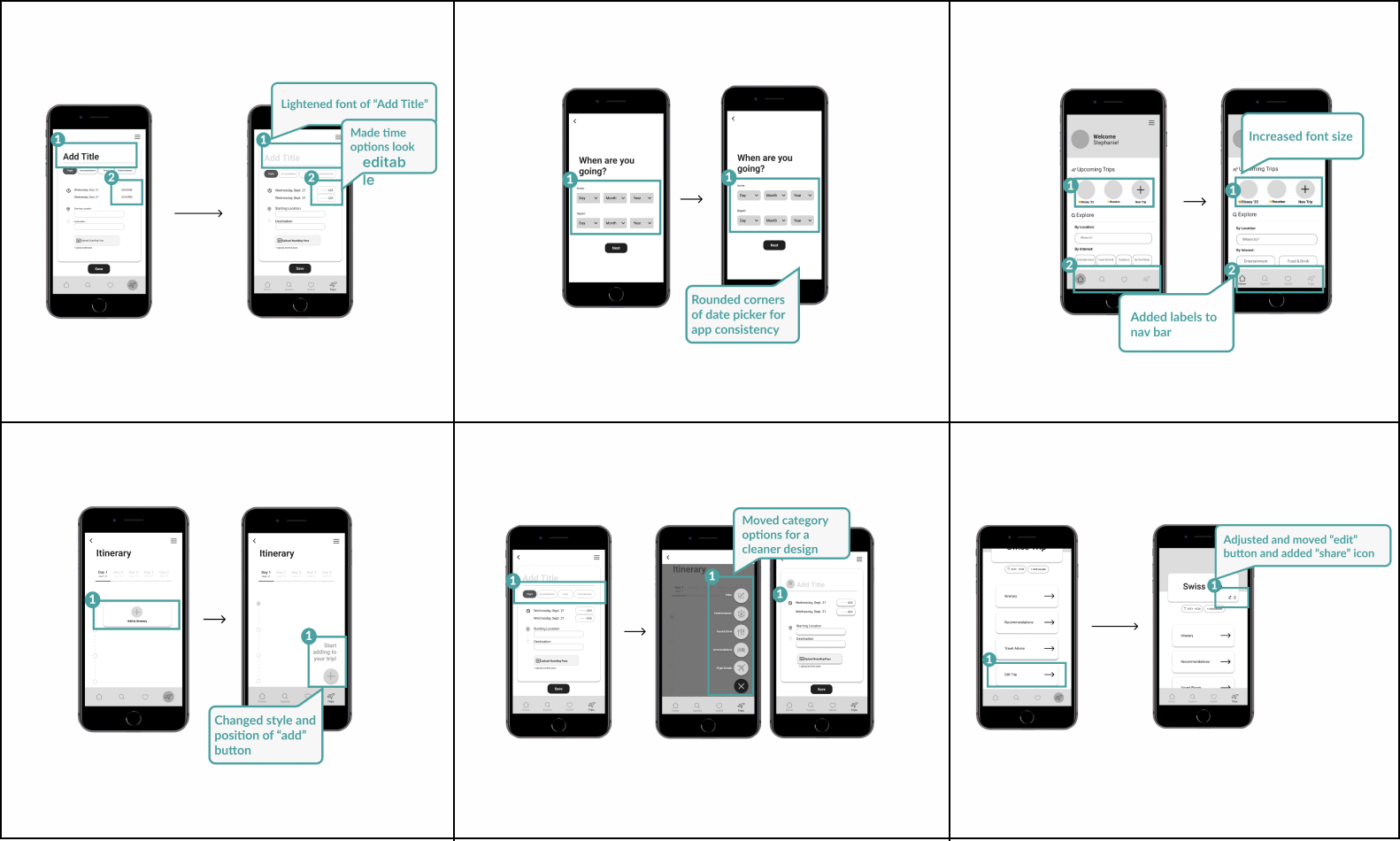
With my mid-fidelity prototype, I conducted two rounds of usability testing to ensure the app would function as intended. I gathered the most common feedback and insights and organized them onto a prioritization matrix to identify which changes and adjustments to make first. I focused on issues that would provide the highest value to the user and would require low effort for me to adjust.
Branding
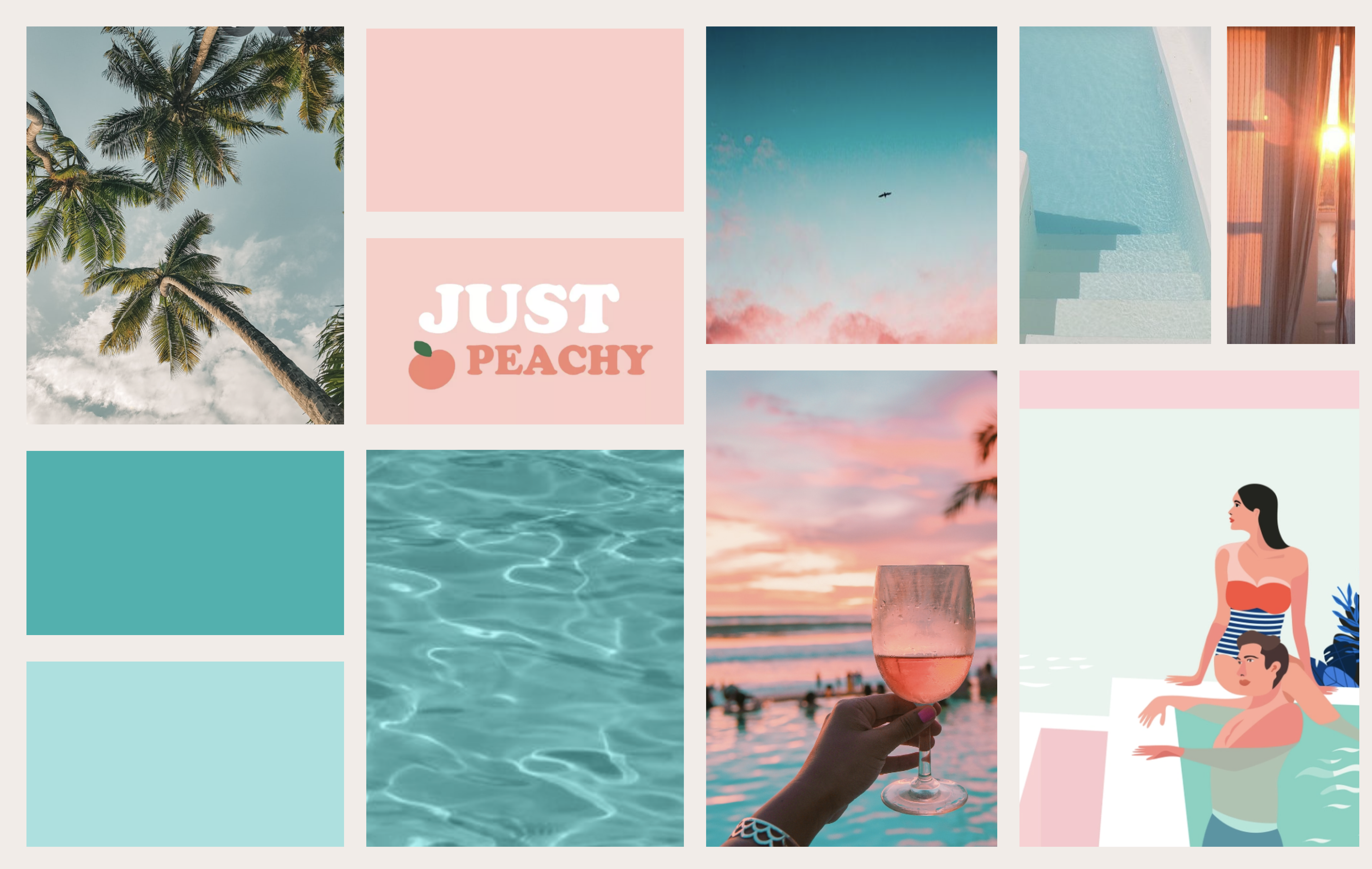
A moodboard was created to inspire and reflect the overall feel of the app, with the key words being: adventurous, simple, beachy, dreamy, and playful but not childish.
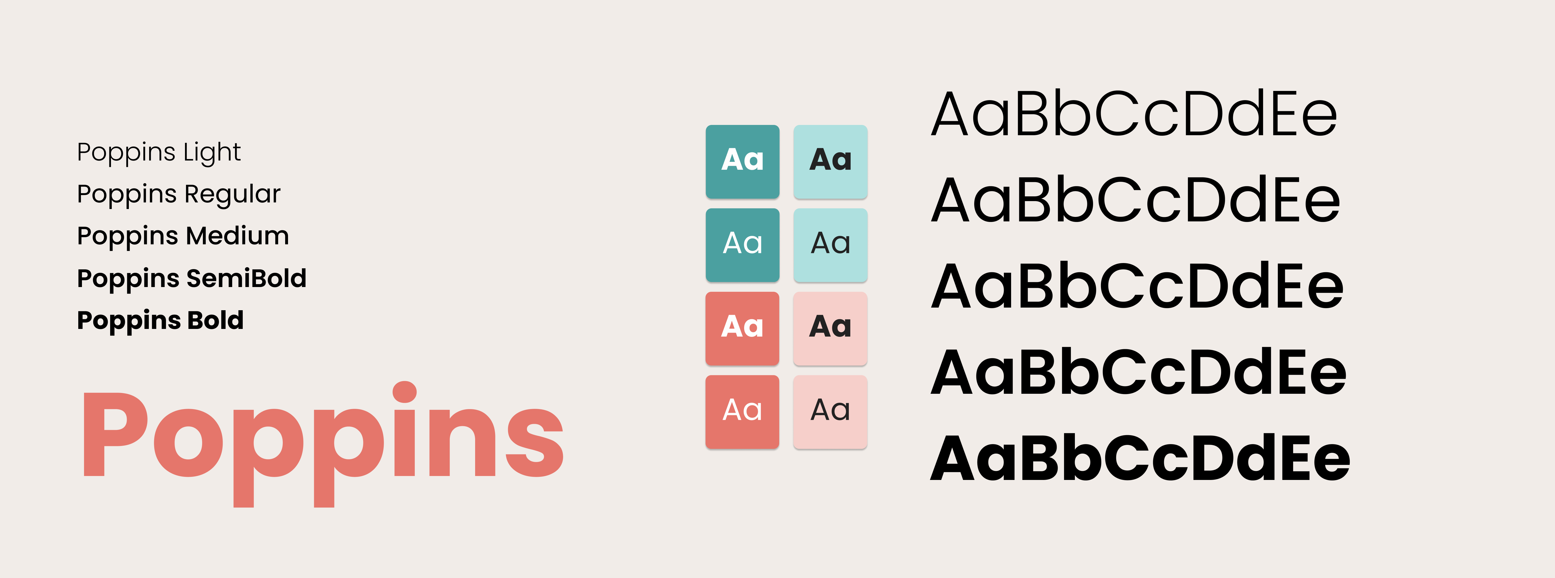
Poppins was chosen as the brand typeface because of its fun and casual san serif appearance. It perfectly cultivated the keywords from the brand moodboard.
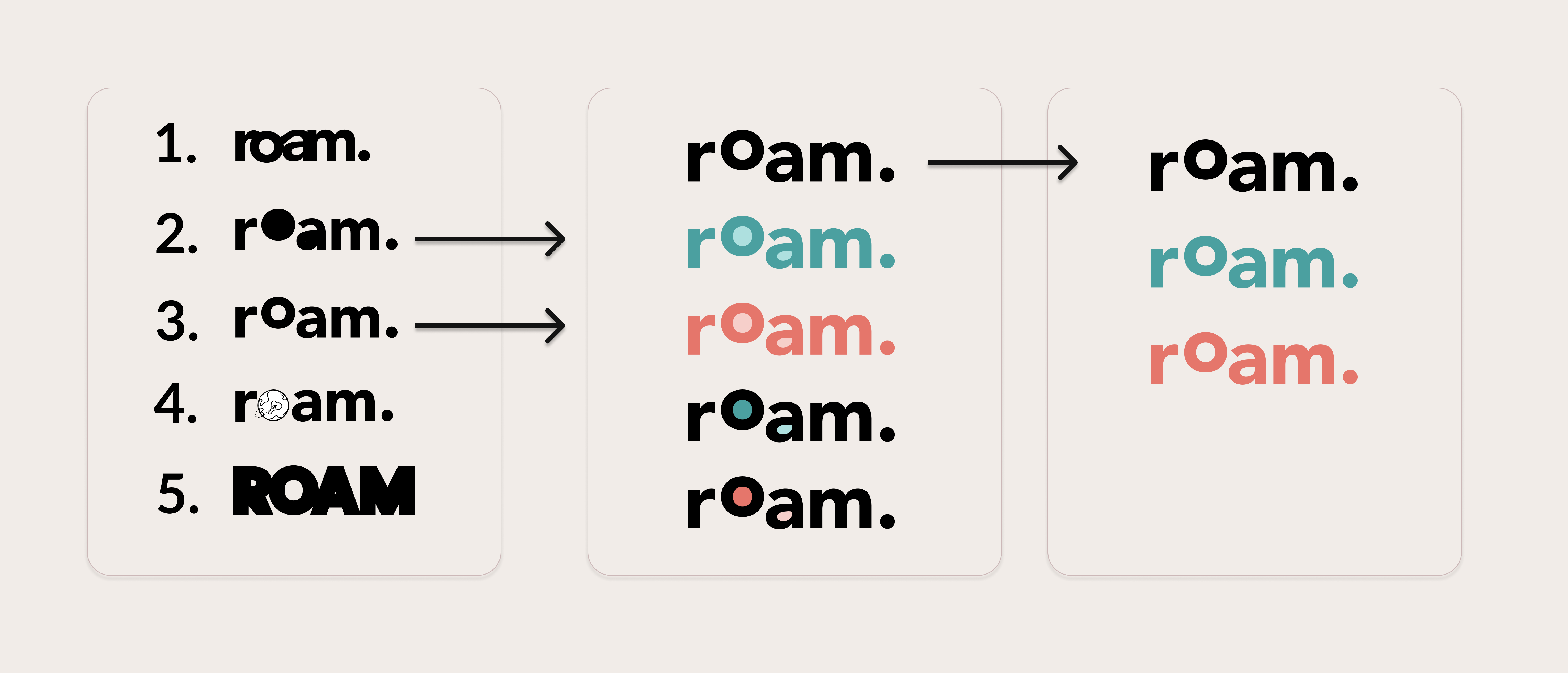
In creating a wordmark, I wanted it to reflect the overall mood of playful and simple while relating to the brand name Roam.
Prototype
Next Steps
As for next steps with this project I would love to continue user testing and developing other task flows and features within the application. It would be great to work alongside a developer to bring these designs to life.
Key Learnings
I learned a lot through this project but here are the main takeaways:
- Ask for feedback early and often. It’s amazing how much insight you can get from a fresh set of eyes on a project.
- Design systems are the secret sauce. Having a design system in place for a project is the key to efficient design.
- Trust the process. More often than not our solution looks different from what we first had in mind, and that’s okay! Always remember you are designing for the user and not you.