Increasing donor’s confidence by creating more transparency in value and impact.
Timeline: 5 days
Role: UX/UI Designer
Team: Sophie, Angela, Anastassiia
Platform: Desktop
Overview
This was a 5-day sprint project completed alongside 3 UX Designers with the goal of improving the donation experience for donors of a nonprofit organization.
Problem
The BC SPCA is a nonprofit organization that aims to protect and improve the lives of domestic, farm, and wild animals within British Columbia. In 2021, the BC SPCA helped 118, 917 animals (Spacey, J., 2022).
This organization relies heavily on donors and volunteers to fund and run its day-to-day operations. Our team’s goal was to evaluate and enhance the donation process on the BC SPCA’s website.
Constraints
We were only required to work with the user flow of a user making a donation and we followed the current BC SPCA brand guidelines to maintain cohesiveness.
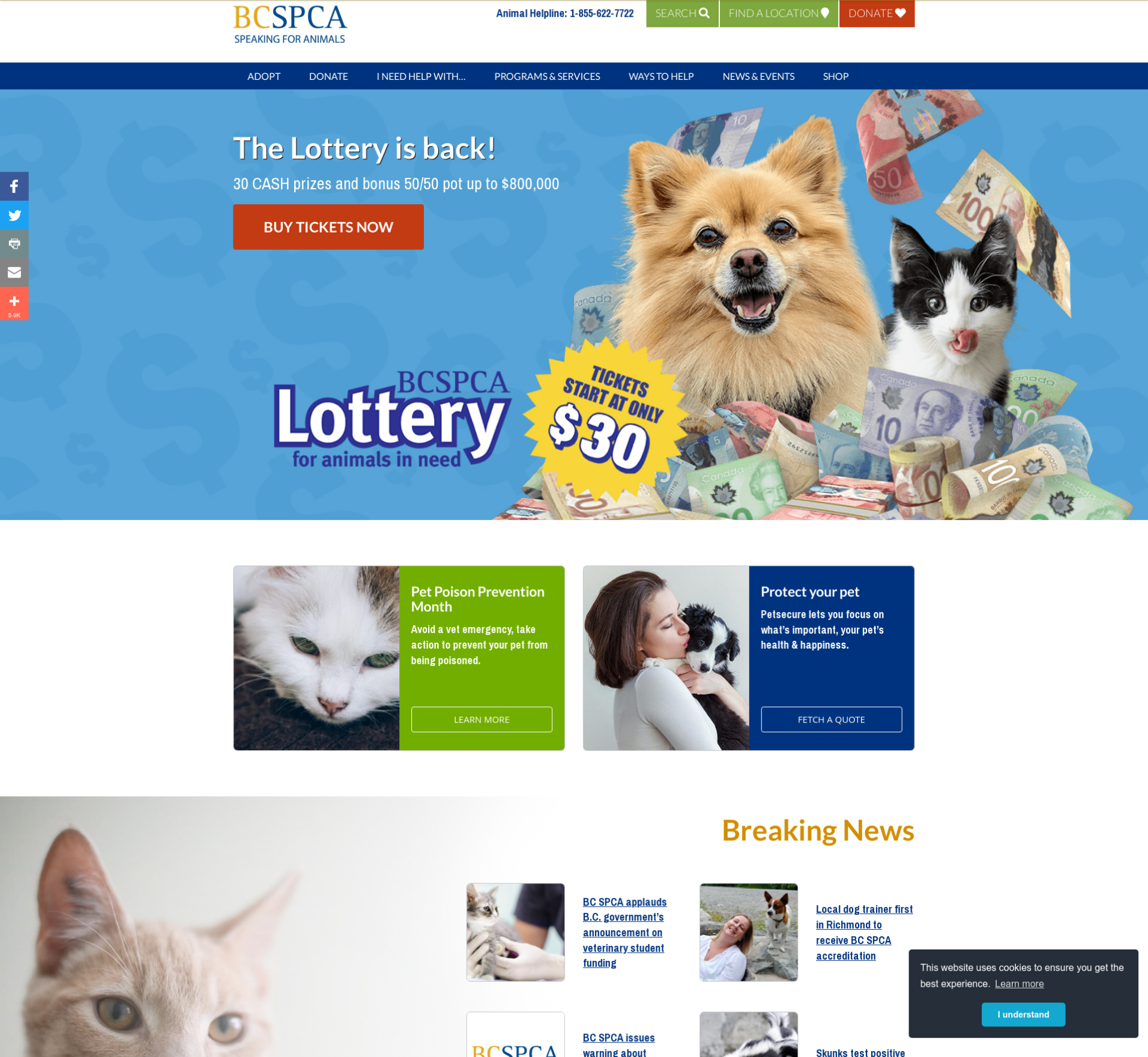
Heuristic Evaluation
First we needed to see what our starting place was. So we did an evaluation of the usability of the original site, for this we used Neilson Norman’s 10 Usability Heuristics as our guide. Here’s what we found:
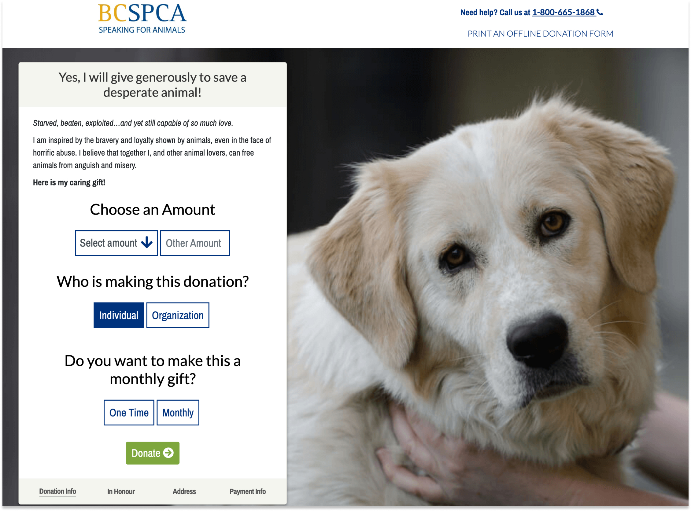
❌ Negative language (Heuristic Principle #2: Match between system and the real world)
- The language used in the donation process is very negative and can guilt the user into donating rather than educating and inspiring.
❌ Busy and overwhelming design (Heuristic Principle #8: Aesthetic and minimalist design)
❌ Lack of explanation (Heuristic Principle #10: Help and documentation)
- The language used in the donation process is very negative and can guilt the user into donating rather than educating and inspiring.
User Research
Canadian statistics show that $9 out of every $20 donation comes from donors aged 65 and older (Government of Canada, S. C., 2022).
We chose millennials (ages 25-45) to be our demographic as we hope to encourage more donations from the younger generation.
Assumptions
Below are some of the assumptions we had about our target demographic:
- Millennials are turned off by poor design and copy writing
- Donating to a cause makes people feel connected to something greater
- People are not always confident in the organization’s transparency and therefore don’t feel confident donating their money
- Donating can improve mental health and well being
Interview Insights
To validate our own assumptions, we conducted interviews with a select group of individuals who fit our participant criteria below.
- Ages 25-45 years old
- Lives in British Columbia
- Has donated at least once in their lives
- Loving animals would be a great bonus

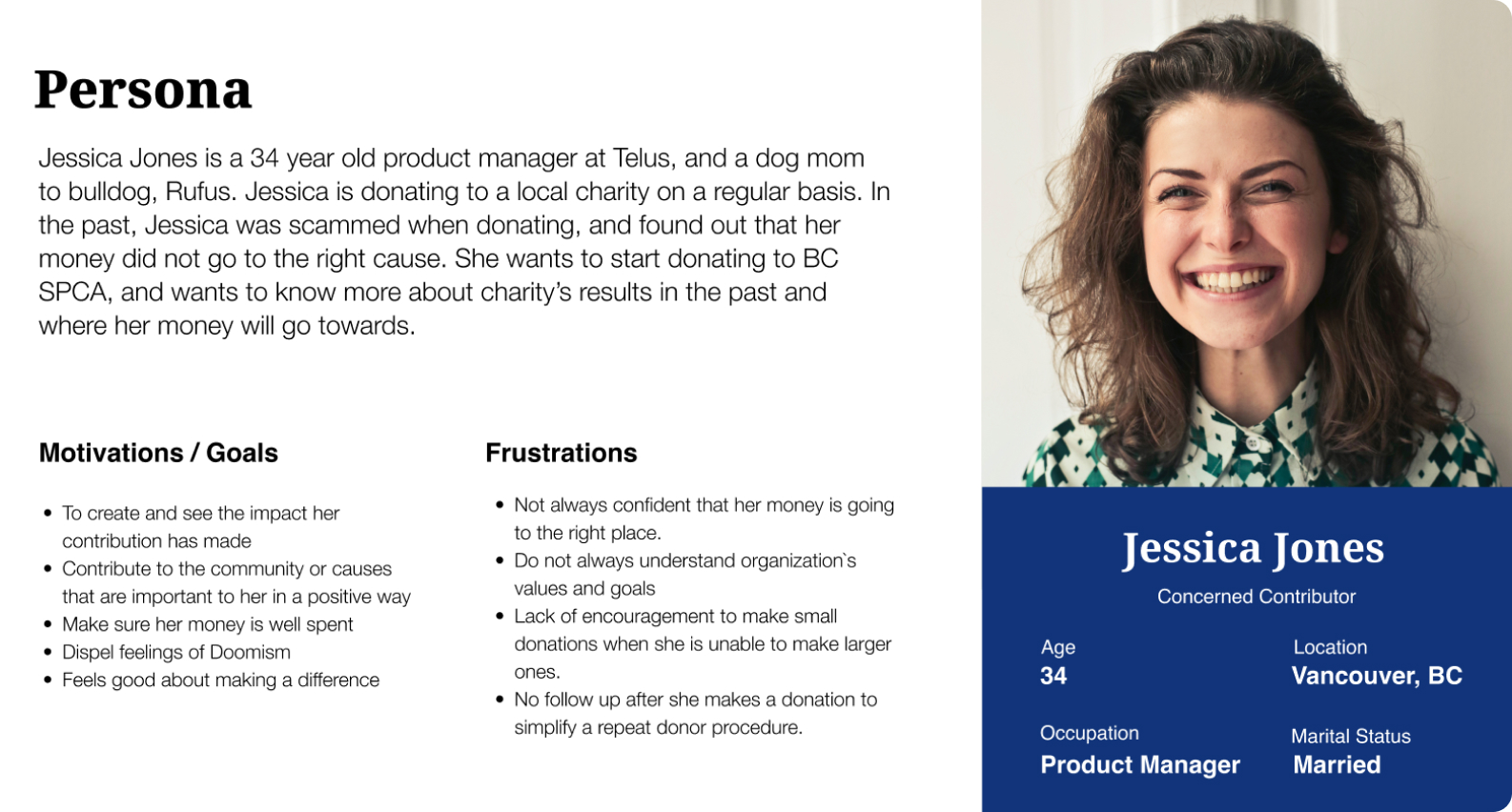
To represent our target demographic and findings, we created a persona built directly from our interview insights and research.
How might we effectively communicate the BC SPCA’s value and impact in order to increase donor’s confidence when donating?
Ideation
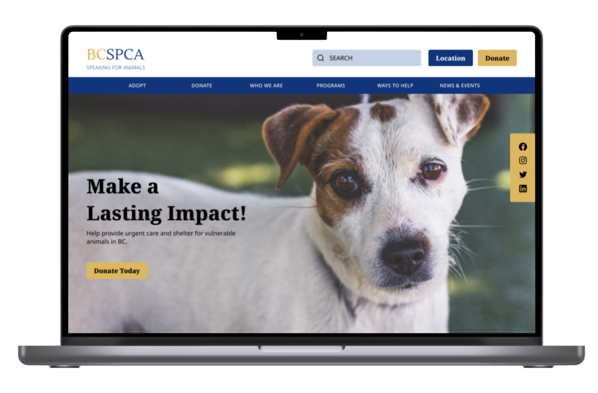
We mapped out a simple, high level user flow for our individual donor. Our intervention comes into play when she clicks on Donate as we aimed to provide more transparency and information, so that she feels she has more control as to how she gives and so she can see a measurable result.

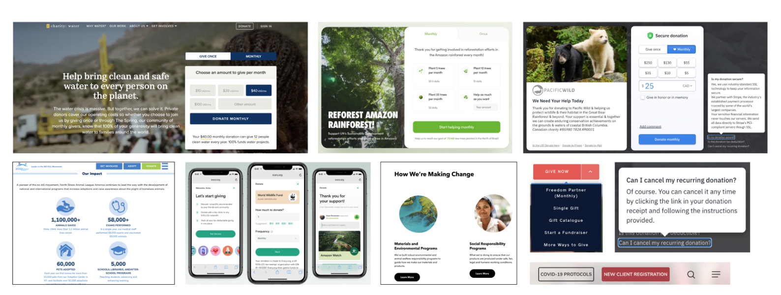
We sought out inspiration from various sources to help get ideas flowing and see how other organizations create transparency in their donation process.
- Some components that we were inspired by below include:
- Donation summary and impact right under the donate card (top left).
- Having the measurable and concrete impact displayed when donating, ie: plant 10 trees per month (top centre).
- Monthly vs One time donation button being default active state, very sneaky (top right).
- Impact clearly quantified with simple design and statistics (bottom left).
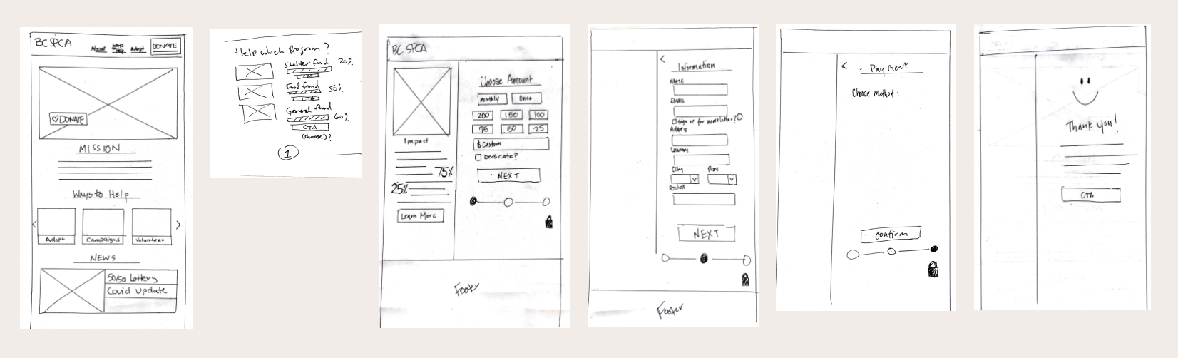
Heading back to our sketch pads, we created solution sketches with the focus on how to increase transparency, communicate impact, and improve donation flow.
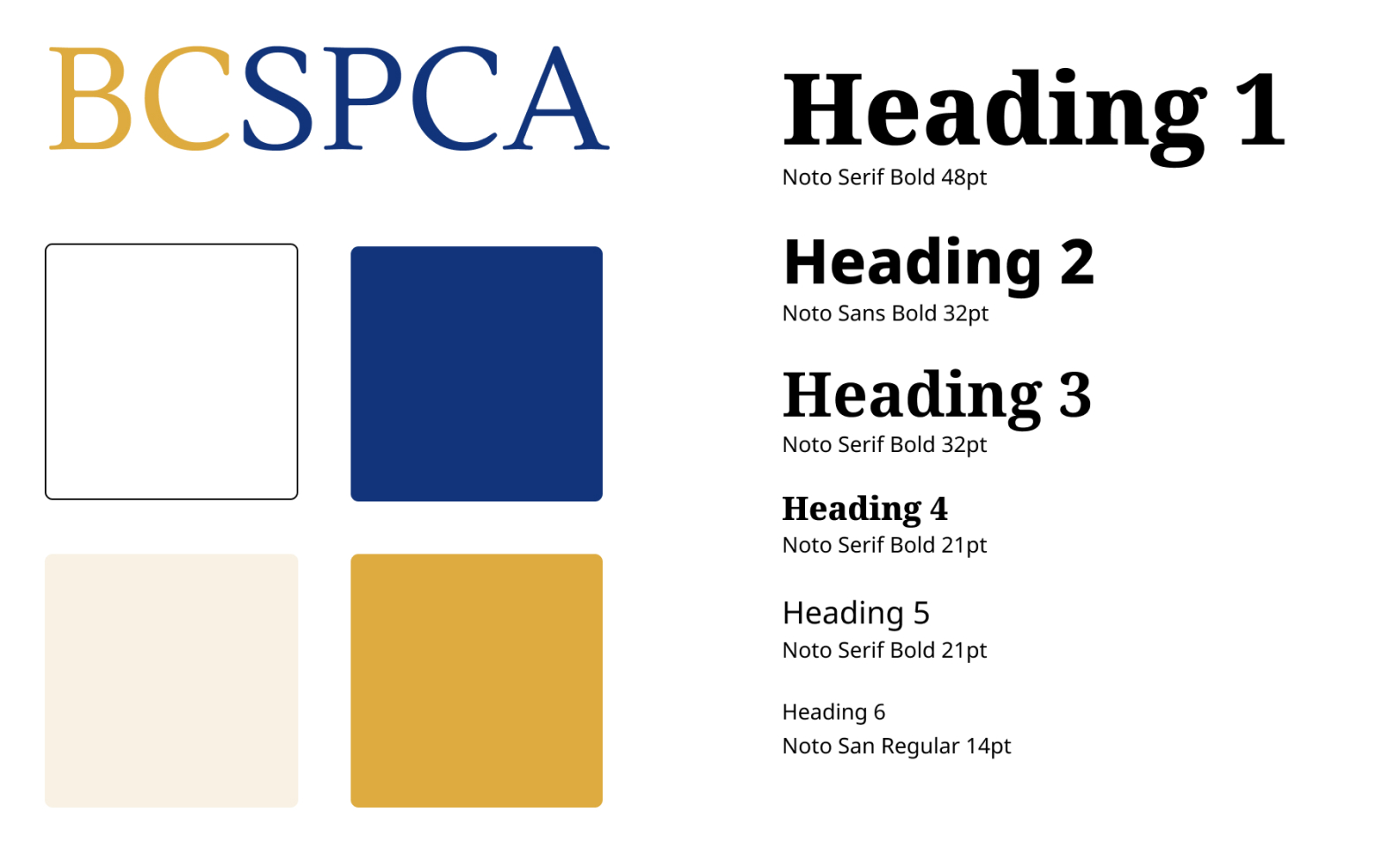
Brand Guidelines
From there we created a style guide and aimed at maintaining the recognizable identity, while updating the branding with a fresh, modern look.
Prototype
User Testing
After we had our prototype ready, we dove into user testing. We completed 5 user testing sessions and gained a ton of valuable insight. We learned that...
- Our donation page fundraiser was unclear as we forgot to provide context for the progress shown on each campaign
- The "share" button at the end of the donation flow had no context and the user did not know what they would be sharing
- Buttons and photos were not consistent
- Users would like to have confirmation of their donation amount and frequency before committing to donate
We created a prioritization matrix after testing, which really helped us to narrow our focus.
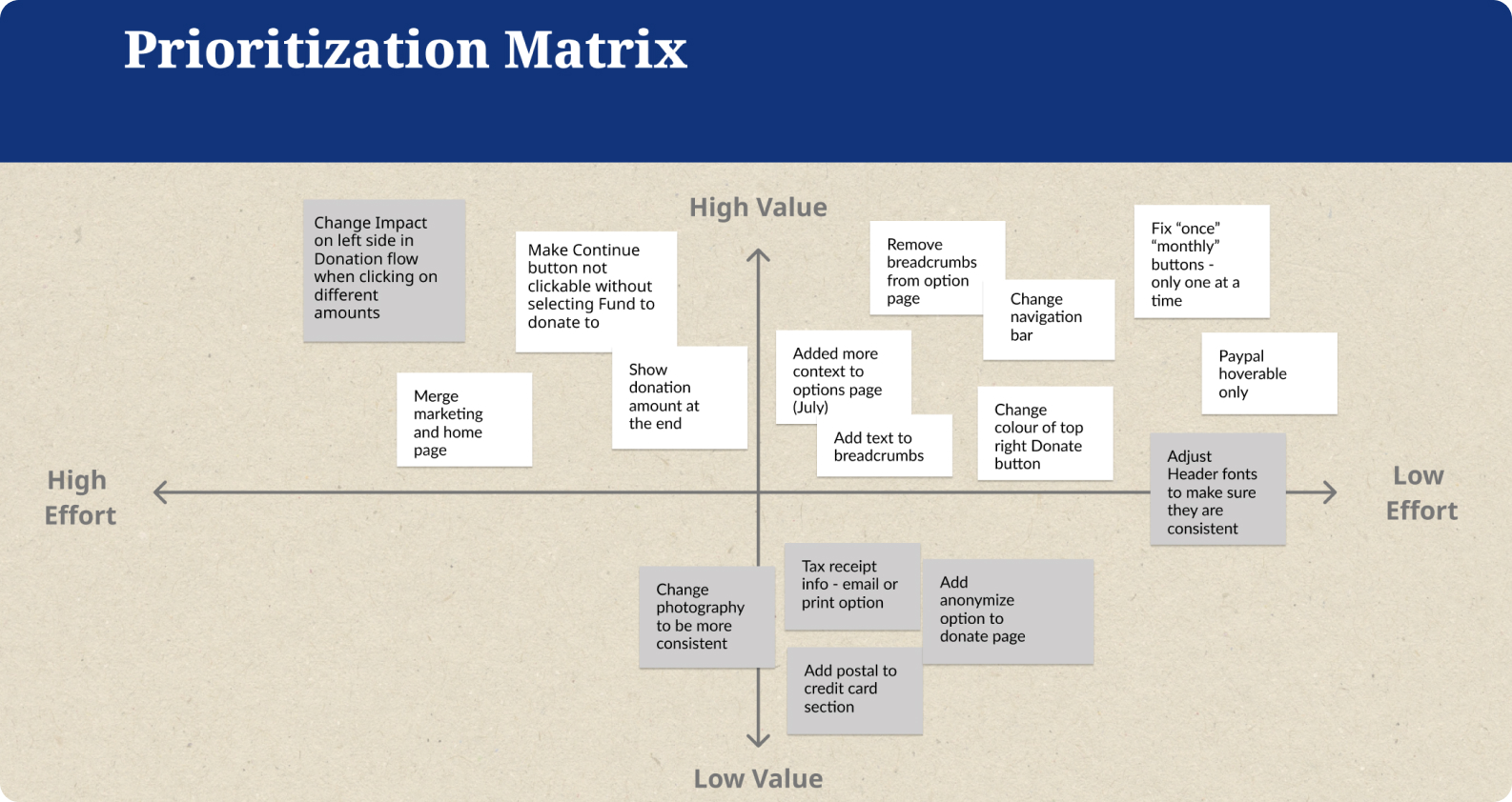
In white are what we chose to prioritize fixing, considering the time restraints we had. We prioritized high impact/low effort to improve the user experience.
Next Steps
Due to the time constraints, there was a lot we couldn’t get to. Here are some of the next steps we’d want to take:
- Enabling the Impact results to change in real time and reflect accurately what the donor will be providing, when hovering over different monetary amounts in the Donate flow, ie: $10 leading to one leash, $200 leading to 10 dog beds
- Adding a Share on Social! button with shareable content to incentivize sharing the cause. Perhaps in the form of a shareable badge, or at least some surprise confetti
- Having more positive reinforcement after donating, perhaps in the form of a shareable badge, or at least some surprise confetti
Key Learnings
As a team, we learned quite a lot during this design sprint.
- Properly naming files and components is important when working as a group
- Delegating roles helps get things done, dividing and conquering is key, and frequent communication is essential